
Good morning everyone,
Today we’re going to look back at an older illustrated story published at Giantess Club. Of note, this comic was written by Clovis. He graciously agreed to be the first creator to be interviewed by There She Grows back in May 2019! (Click here to read that post.)
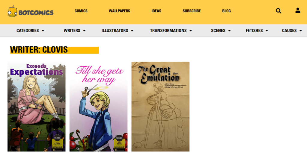
So far, Clovis has written three one-shot comics for BotComics. Their covers can be seen in the following screenshot:
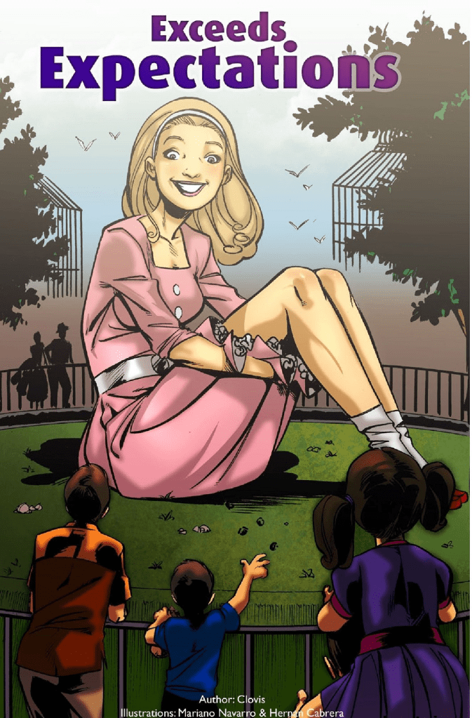
Clovis asked, not long ago on the Process Forum, for my thoughts on “Exceeds Expectations.” So, without further ado, let’s dive in!
“Exceeds Expectations” was released in July 2010 on the Giantess Club web site. Giantess Club first came online late in 2009, around October of that year. Therefore, Exceeds Expectations was one of the early comics released during its first 12 months of operation. (SIDE NOTE: A “Coming soon!” message was in place at GiantessClub.com as early as July 31st, 2009. The giantess site was created by BotComics, the company which had earlier created the Breast Expansion Story Club.)
Exceeds Expectations narrative is simple, but fun. It’s a day in the life of an extraordinary young woman named Sally Hinkle. Sally is a stereotypical nice girl from a small town, the “… pride of Cattleberry, Kansas …” She was a straight “A” student. Nonetheless, despite her goody two-shoes nature, she became a great source of anxiety after being transformed into a giantess by a “… strange beam …” during an outing (presumably some sort of school trip).
After her transformation, Sally moved into the zoo. There she watches over and cares for several large animals, such as bears, elephants, giraffes, etc. Although her unusual size and corresponding immense strength concerns the rest of her community.
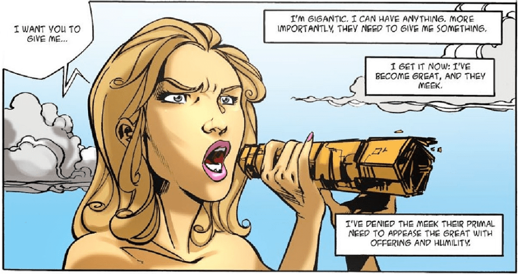
This is actually a special day as Sally sets out to demonstrate that while she is benevolent, she is also supremely powerful. Authority figures try to dissuade Sally from taking an unsupervised trip, but she persisted. For instance, a heavyset man called Sam, presumably the zoo manager, first tried to convince Sally to wait for an escort before leaving the zoo. However, she ignored his suggestion and set out for town, growing larger as she traveled.
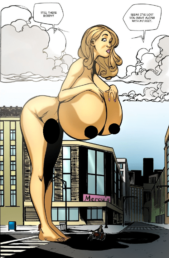
Police officer Jenkins also asks her to stop, but his effort was similarly unsuccessful. Additionally, her conservative clothes slowly rip apart as Sally steadily grows larger. That was a nice touch. Perhaps thematically it meant to signify that Sally was shedding her old identity and taking a more mature approach to life. She was no longer an innocent young girl, but a woman. Reinforcing that theme was the breast expansion Sally underwent after she encountered her ex-boyfriend Bobby. Bobby had dumped Sally a few years ago because she wasn’t “… woman enough for him …” and was too modest about her body. However, as demonstrated in the following image, Sally had become far too much for him to handle 😉
Eventually, Sally makes a demand and the status quo is restored. She has now effectively demonstrated her unequaled power.
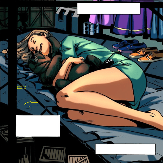
Regarding potential improvements, more variation in the coloring would be my first suggestion. For instance, in the final panel, the several mattresses which make Sally’s bed appear to be the exact same color as the floor:
Additionally, a military jet was depicted in a rather crude style, not resembling any real-world fighter aircraft. In that same vein, the uniforms worn by the service members were bland and generic, not equating to anything actually worn by American Airmen or soldiers.
Lastly, there was an ice cream cone which looked rather unappetizing. It felt out of character and did not fit the scene. At that point in the story a bright, colorful, and tasty-looking frozen dessert would have been appropriate for the mood. Yet, it looked gross:
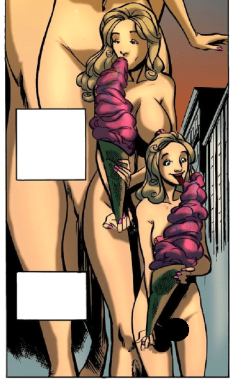
Something like the following stock image of an ice cream cone would have been better:

An argument could be made that it would be difficult to form round ice cream scoops at such a large scale, which is certainly true. However, it would be equally difficult to make the ice cream cone itself. It was more than twenty feet tall! So, if the tiny people can make a gigantic cone then presumably they can make gigantic ice cream scoops too.
Overall though, Exceeds Expectations is strongly recommended. It’s a thoughtful comic which size fans should appreciate. Furthermore, per his interview, Clovis already has an outline for a sequel, “Managing Expectations.” Here’s hoping it gets published someday!
(NOTE: For those who want to purchase this comic, please consider using my affiliate link: https://dashboard.botcomics.com/dashboard/aff/go/solo_affiliate?i=45
Doing so would support this blog and would be much appreciated!)
That’s it for now folks. The next review will be published on Friday instead on Thursday. It’ll cover something a little different. That post will discuss a size-focused tale centered upon a mighty warrior. Some have called this deadly warrior a wanderer. A few folks may have also commented that the barbarian-looking warrior had beefy arms, but apparently he skipped leg day. Others have even called him a little dumb, but no one has ever doubted his katana-wielding skill! Until then dear readers, keep growing 🙂
This review was written by SolomonG and is protected under Fair Use copyright law.
All Rights Reserved.

Thanks so much for taking a look at this story! It was done as part of a contest. One of the editors mentioned a lack of gentle stories and I wanted to really explore something beyond the simple “good girl grows big.” Would anyone really trust or be comfortable with a giantess no matter how gentle, and what might she do to quell those concerns?
Unfortunately there’s no back and forth with the artists, they take the script and that’s that. Overall, I’m happy with what they did, but agree with your quibbles. The billboard was meant to be rolled up into a proper cone shape which would at first act as a bullhorn and then used to hold the ice cream which I admit, looks weird and appears to be exclusively one flavor (raspberry?).
There is a sequel concept that I’m quite excited about and again explores aspects of the giantess that I don’t feel have been explored before. I’m just not sure what to do with it at the moment.
Thanks again to SolomonG and all who have read this comic!
LikeLiked by 1 person